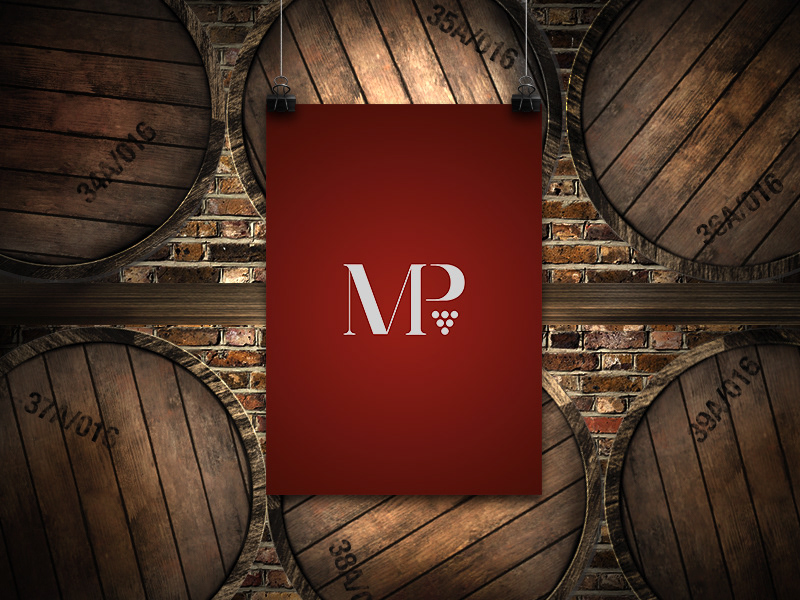
Mr.Martin Peshev is a very passionate and highly skilled sommelier living and working in London.He worked for some of the most important restaurants in Rome and London: La terrazza dell’Eden (Rome) Aldrovandi Palace Hotel (Rome) Hotel Palazzo Manfredi (Rome) Locanda Locatelli (London) Park Chinois (London).These are just a few of the places where he served…I was asked to design his brand identity so I started designing his logo creating a monogram with two custom sans serif letters joined together with a graphical element that represents a bunch of grapes.These elements combined,confer a great and appropriate vintage look to the logo.Keeping this old fashioned look I developed the rest of his brand identity using a simple,harmonic and at the same time,trenchant color palette : a bordeaux red,which remembers the color of a red wine and an olympic white which contrasts the dark tone of red and giving fluidity and clarity to the whole identity.Every stationery object is designed in two versions,bordeaux red/olympic white and viceversa.This choice was made to create a touch of rhythm and modernity between the printed elements.The font family selected for the entire project is : Hoefler and co. Surveyor. which respects perfectly the vintage “mood” of the brand identity. The result was much appreciated by mr.Martin Peshev and his customers.
Every object is printed on Fedrigoni Paper.